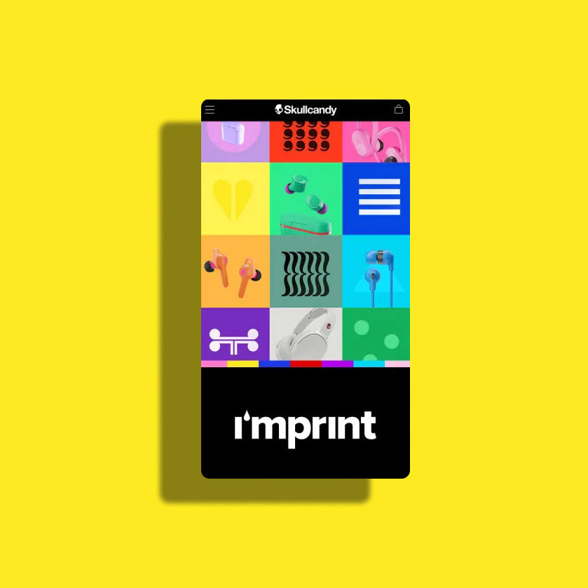
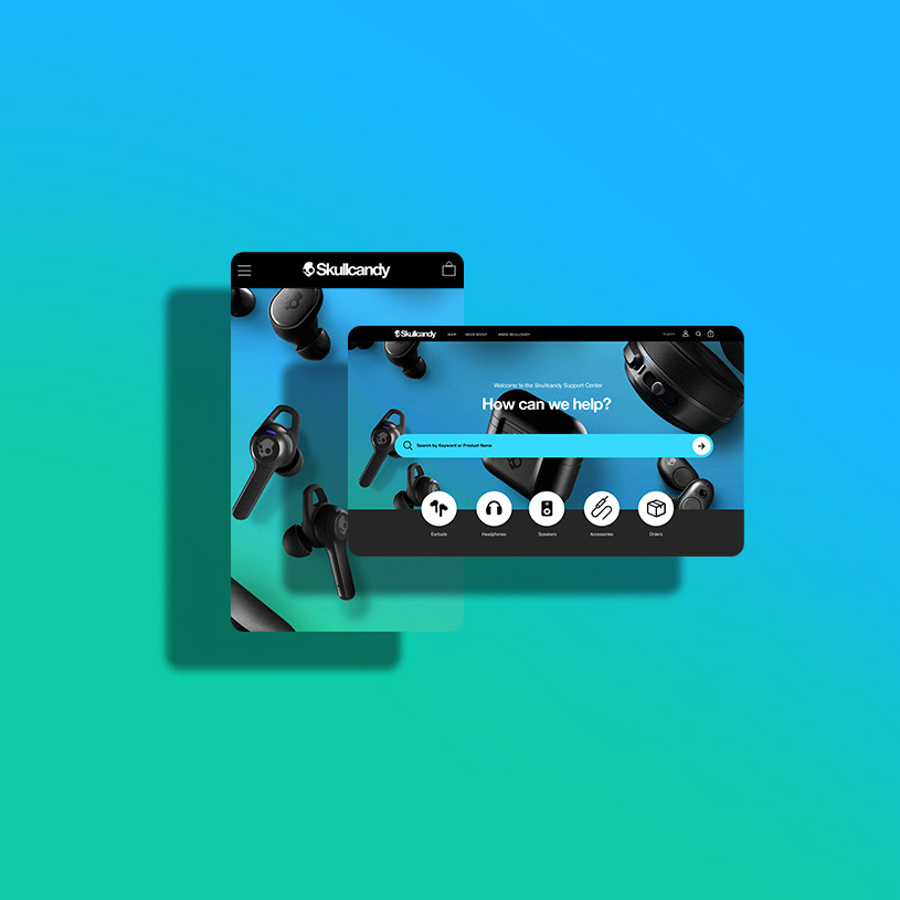
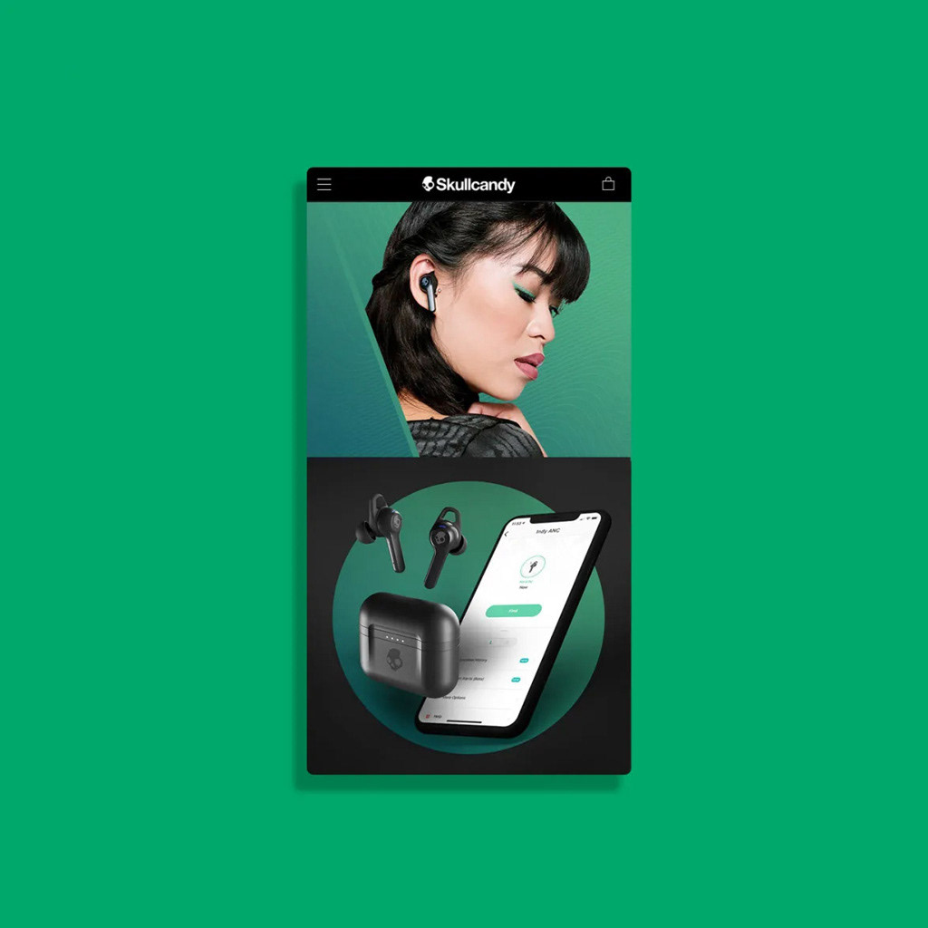
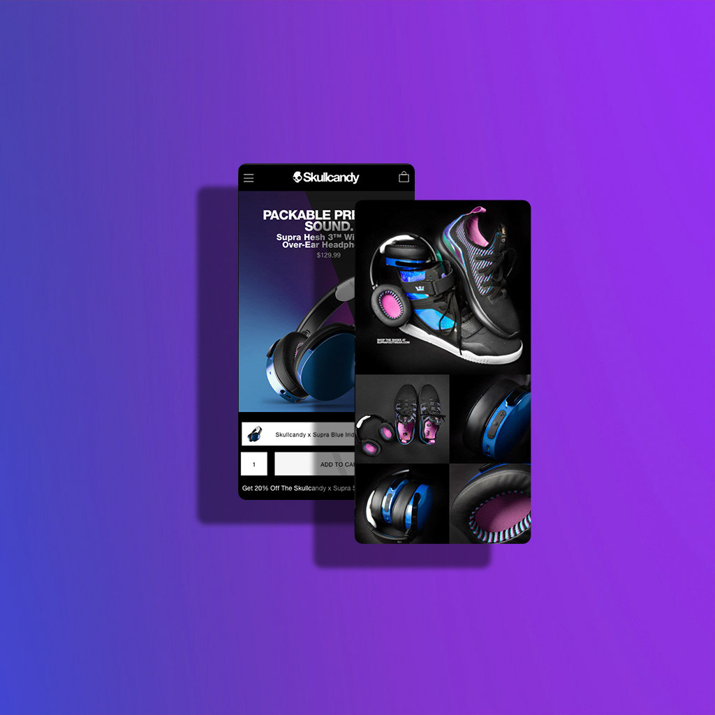
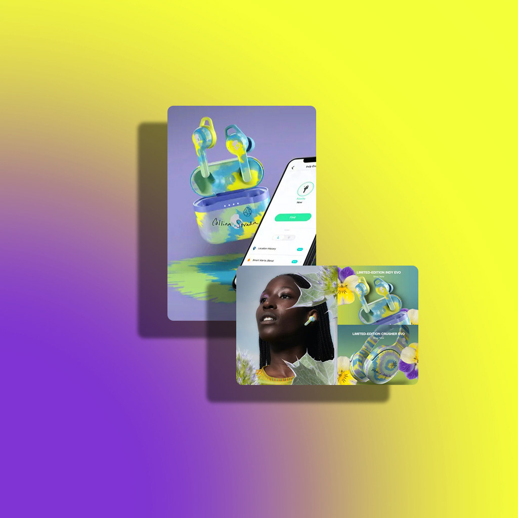
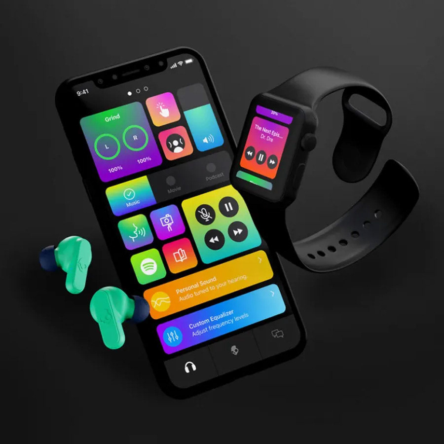
Skullcandy packaging. The goal was to create visual consistency from product to product and let the visuals of the product capture the customers attention. Creating visual consistency with the main consumer marketing touchpoints built value, trust and allowed the brand to become a leader in the noisy competitive landscape.
Research. Through qual eye tracking learnings we visually analyzed type hierarchy, visual language, and refined our colors to reduce cognitive overload. We landed on a primary black packaging design for premium products and color accented packaging at lower price points.
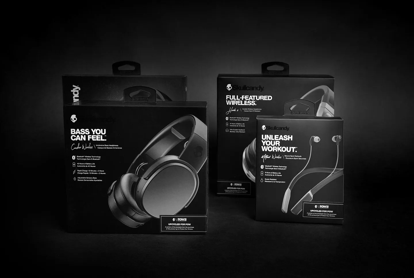

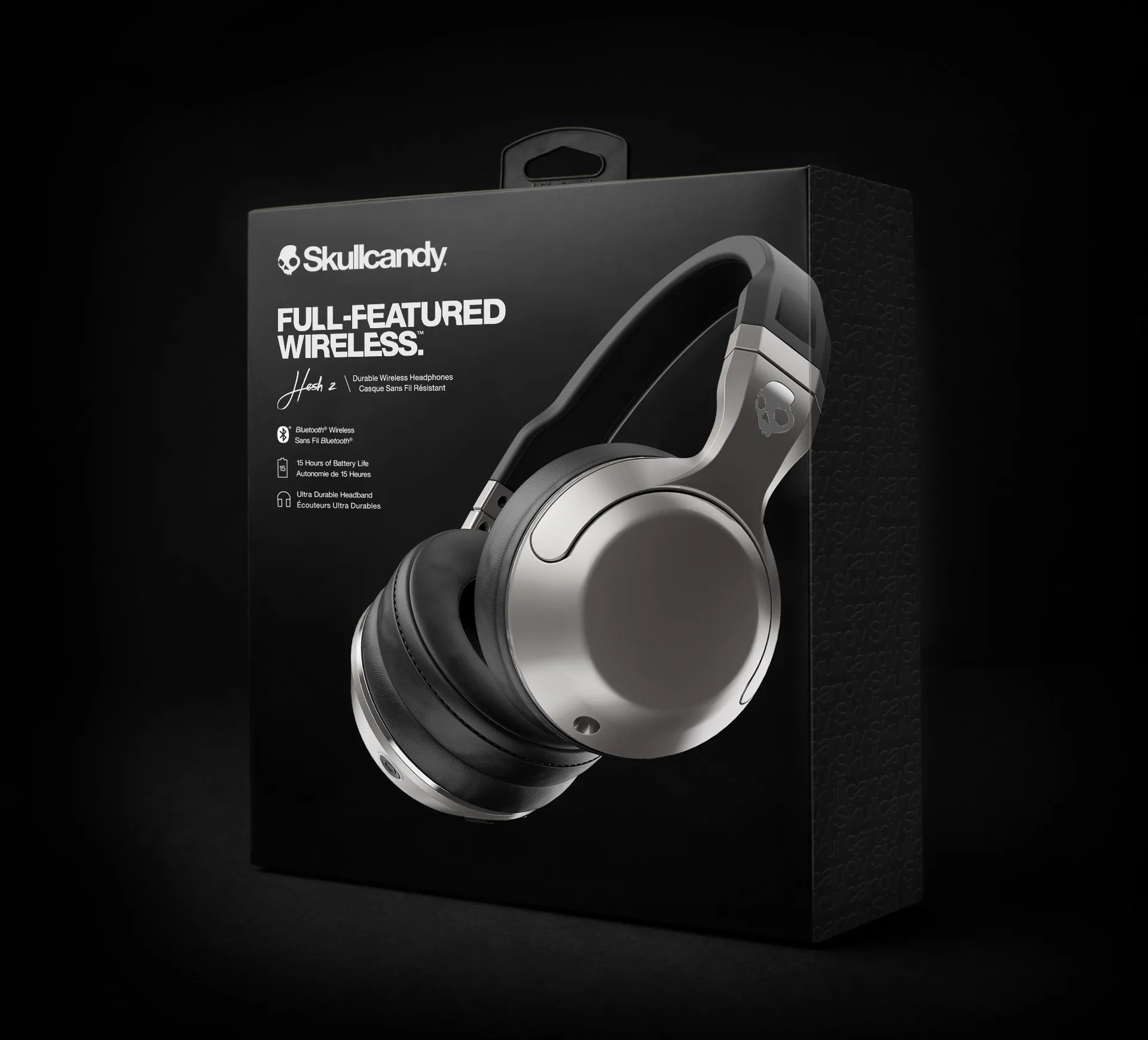
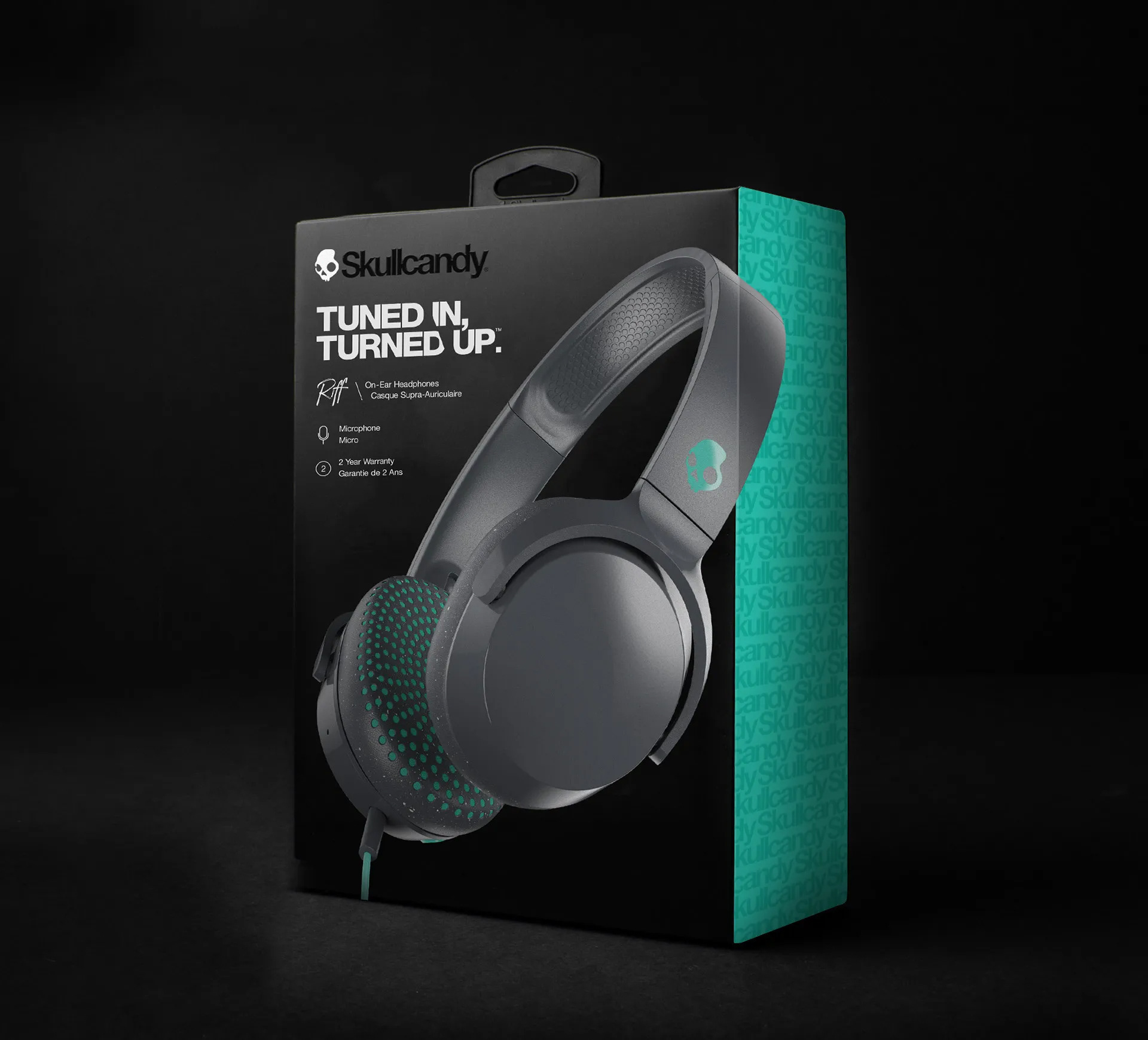
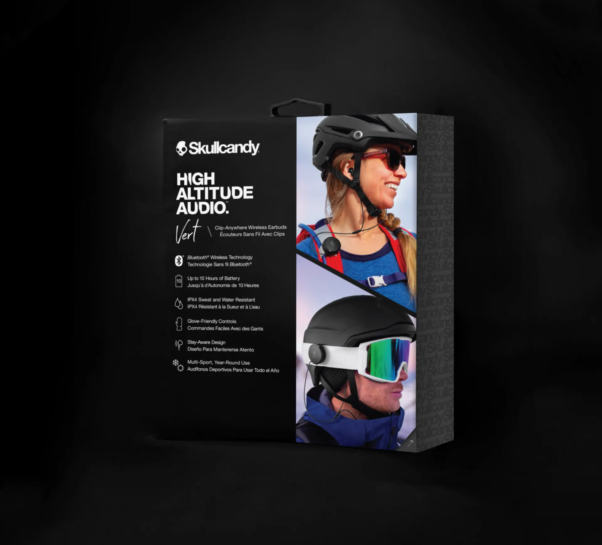
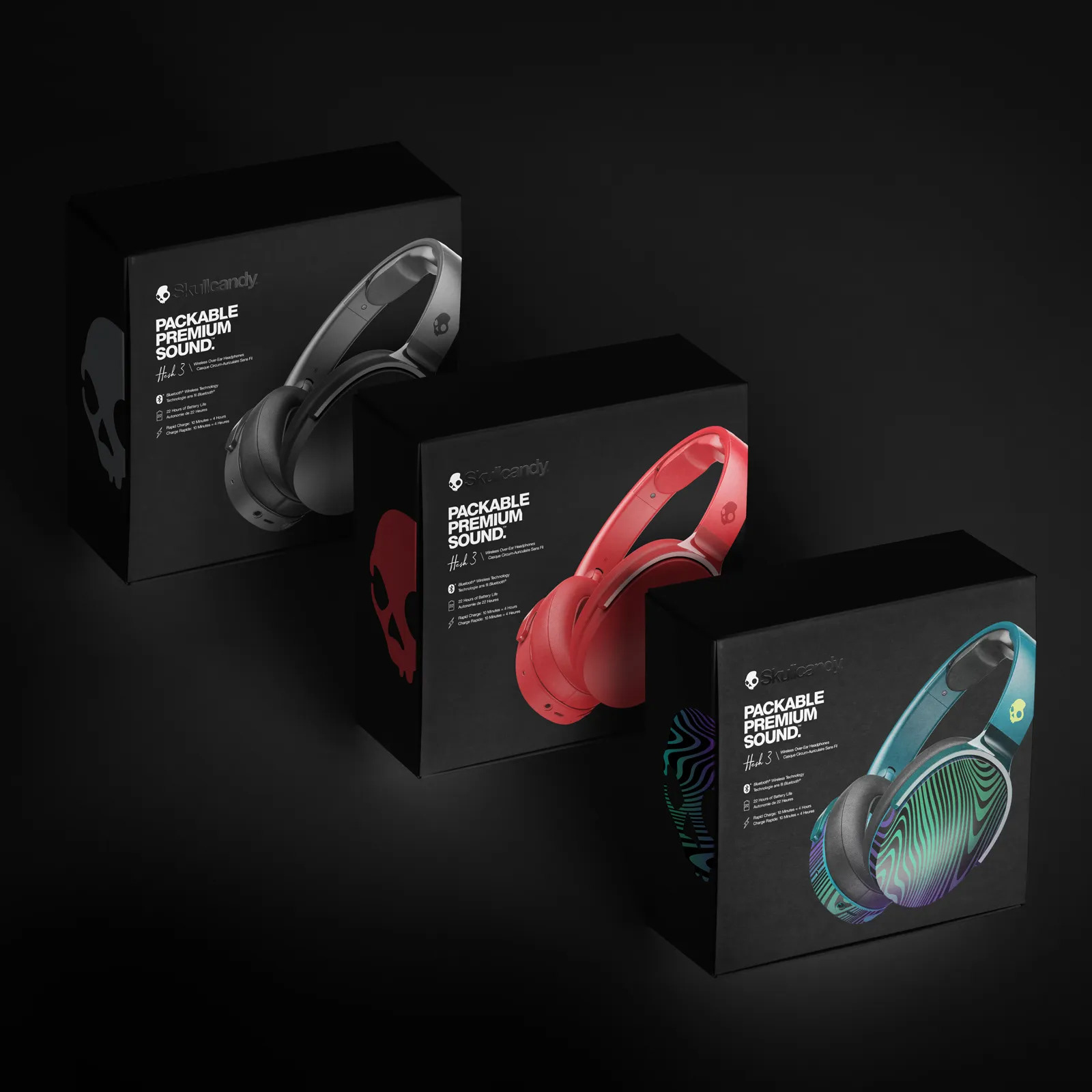
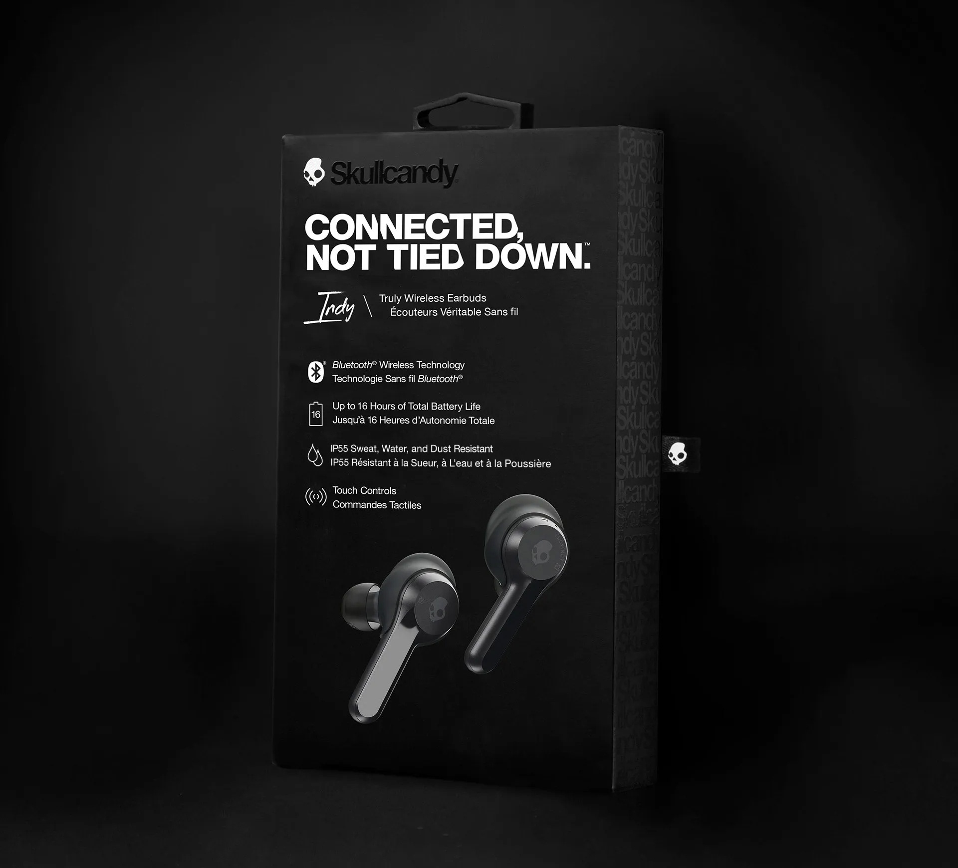
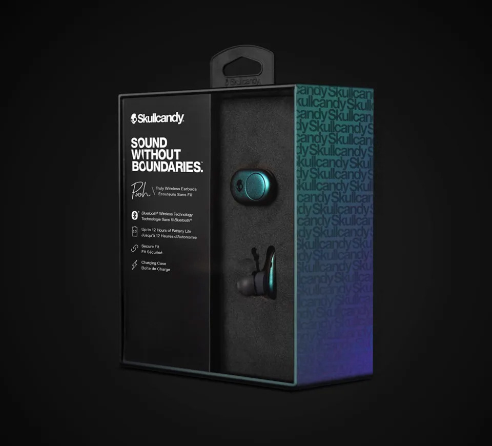
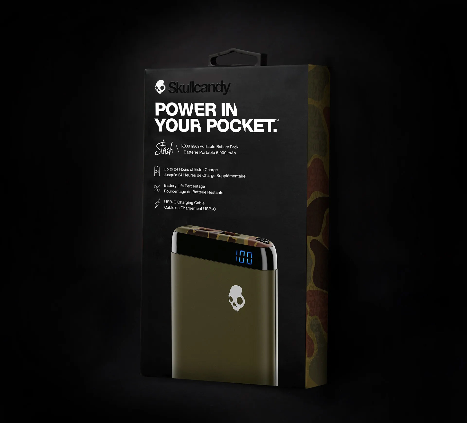
Design challenges. Over months of user testing and refining the designs we launched and reset our product line at retailers in mid 2018. Some of the biggest uphill challenges that we faced was creating a global compliance package design with translations and regional needs, tagline trademarking and remote printing in different factories. Some of the recent exterior design hurdles were creating graphic legibility for an array of anti-theft devices.
Market needs. Retailers designs change and peg space is limited. From chasing trends to learning deeper customer insights, our packaging is always changing but the fundamentals have carried through.
